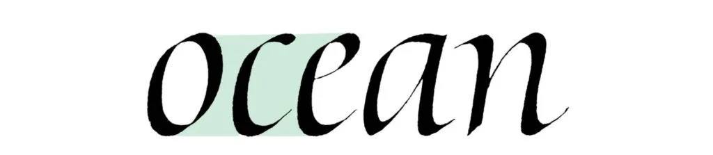
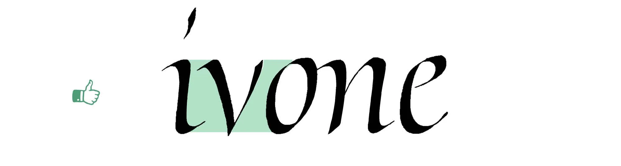
Filip Ciślak Troubleshooting Italic
Speedball is collaborating with calligrapher and educator Filip Ciślak on Troubleshooting Italic, an ongoing content series that helps artists identify and correct common issues in Italic calligraphy. Through clear visuals and expert guidance, Filip shares tips to improve rhythm, spacing, and stylistic consistency—making the series a valuable resource for calligraphers at all levels.
This project showcases Filip’s unique teaching approach and highlights Speedball’s commitment to supporting skill-building and artistic growth within the calligraphy community. Read the full blog post here:
- https://cislakfilip.com/troubleshooting-italic-part-1/
- https://cislakfilip.com/troubleshooting-italic-part-2/
- https://cislakfilip.com/troubleshooting-italic-part-3/
- https://cislakfilip.com/fixing-common-problems-with-italic-the-tricky-triangles/
- https://cislakfilip.com/refining-crossbars-italic-tf/
Troubleshooting Italic – Part 1
Let’s start with a useful perspective: A mistake is only a mistake within a certain context. In Western calligraphy, the most frequent design-level mistakes relate to the three core issues:
A mismatch between letterform and literary theme
Typographers understand this well: a style is only as appropriate as it fits the text it represents. Just as Comic Sans doesn’t belong on a gravestone, a historic Gothic Textura with all its anachronisms may feel out of place in a futuristic context (unless adapted). Dissonance can be a valid artistic choice, but it should be intentional, not accidental.
Inconsistency within the visual theme
Formal calligraphy demands legibility and structural harmony. Informal scripts offer more expressive freedom. Beyond that, each style carries its particular requirements. Italic, for example, has specific historical models and visual logic that guide its construction. Letters must feel like they belong to the same visual system.
Misalignment within the compositional context
A letterform might be beautifully executed in isolation, yet feel out of place in a word, line, or layout. Type designers solve this with alternates and ligatures. As calligraphers, we have the advantage of flexibility and real-time adjustment. That’s what keeps calligraphy dynamic: it’s a constant balance of adaptation and invention.
We’ll primarily focus on the second and third categories – mistakes rooted in visual inconsistency and compositional imbalance. These are often subtler than technical issues like ink flow or paper quality, but they’re just as critical for your work.
That said, from time to time, I’ll introduce some issues related to technique and materials as well, but it won’t be my main focus.
This first installment examines the most basic letters: i, n, m, l, j, h, u. They are grouped by structural similarity. We’ll look closely at common problems in their construction and explore practical ways to correct them.
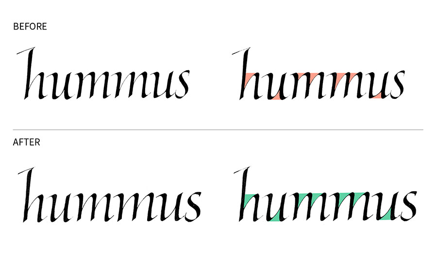
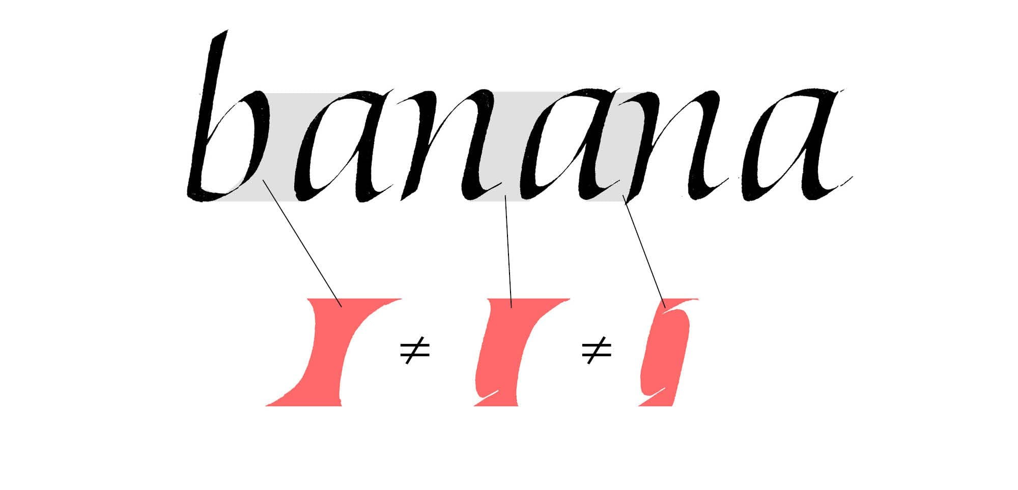
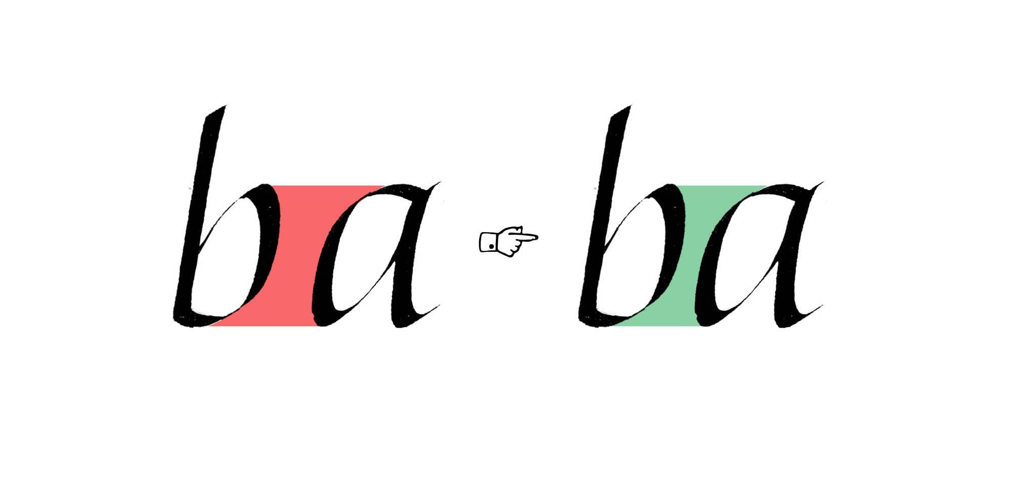
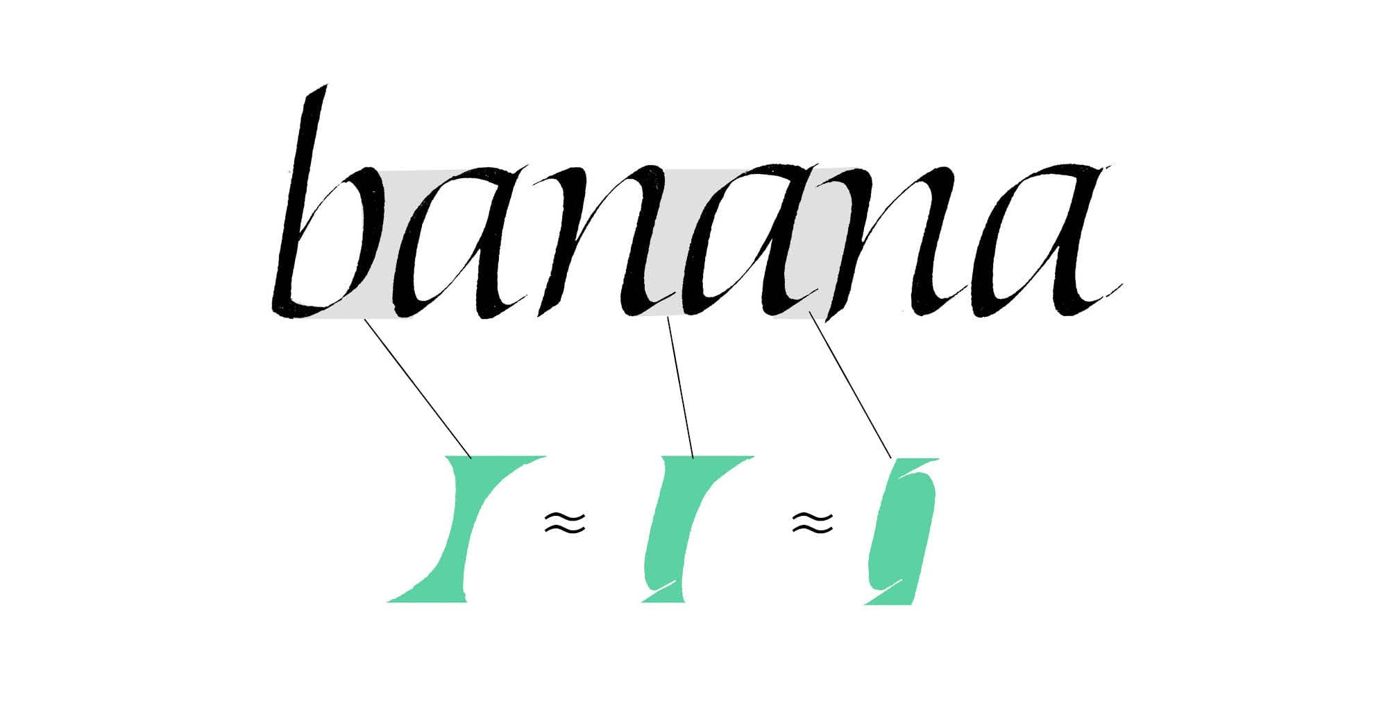
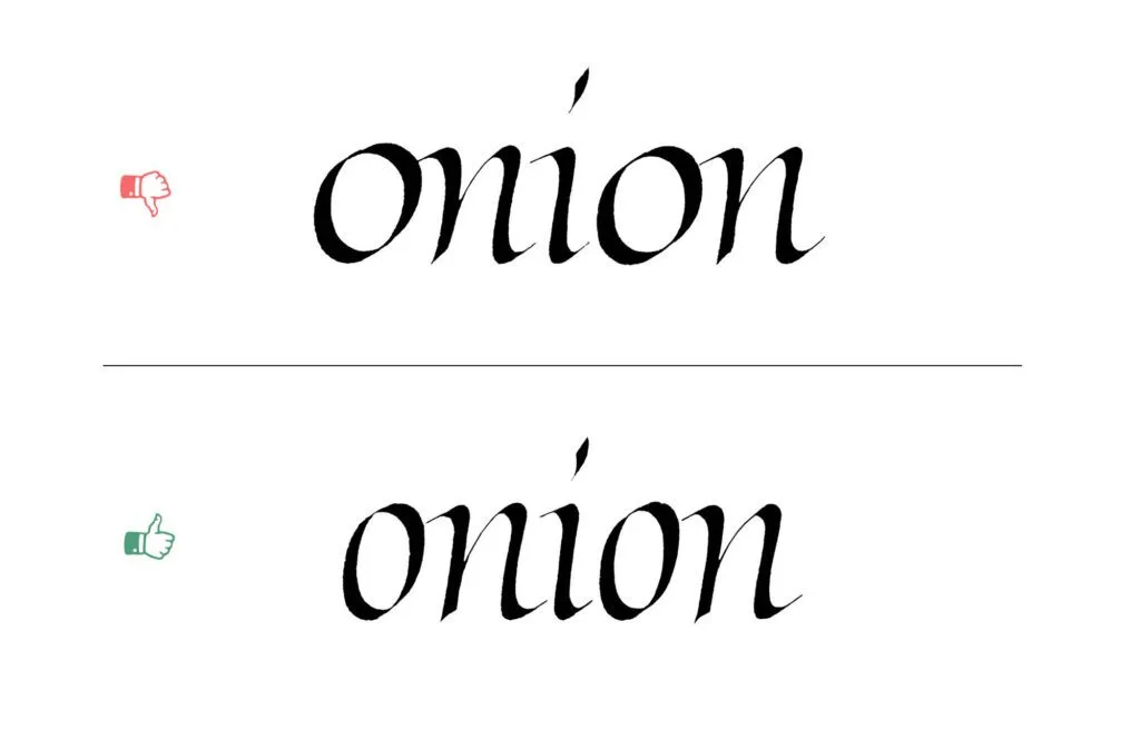
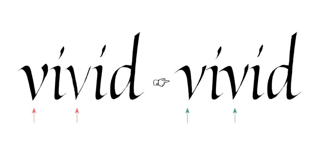
Case 1 – uneven spacing
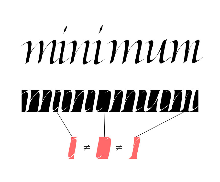
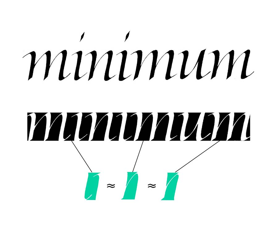
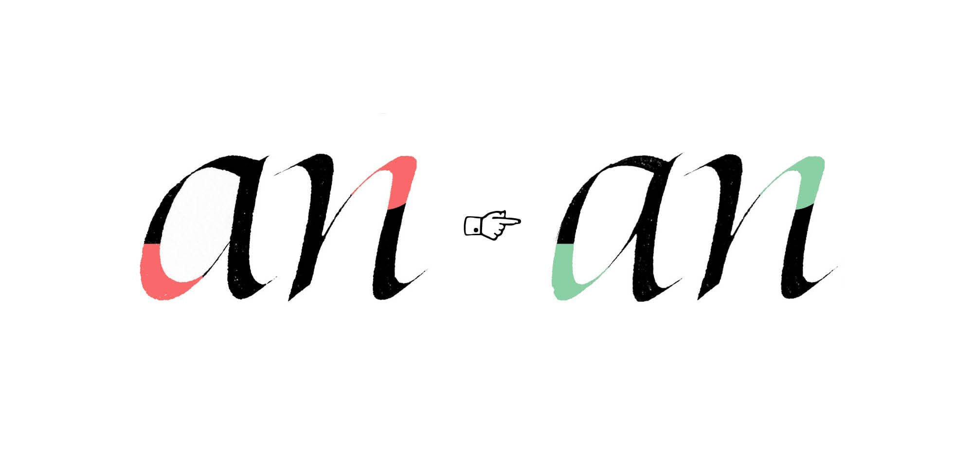
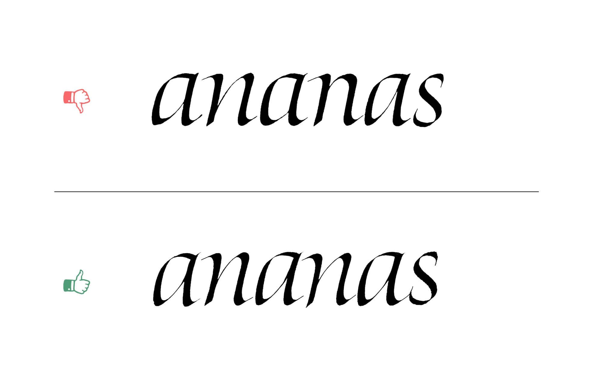
This is a big one – not just for this specific group of letters, but for all of calligraphy. You’ve probably heard that the spacing should be consistent. But what does that mean?
First, it’s important to understand that spacing can’t be measured by the physical distance between letters. Instead, think of it as creating an even distribution of negative space – the space between and around the strokes.
Achieving that consistent rhythm requires a balance between the counterspaces within the letters and the spaces between them. Every detail plays a role: the length of a serif, the taper of a stroke, even the texture and density of the ink. All of these can subtly shift how the spaces feel on the page.
That’s why spacing can’t be reduced to a formula. It’s not mechanical – it’s visual. It’s a skill built through observation, sensitivity, and ongoing practice.
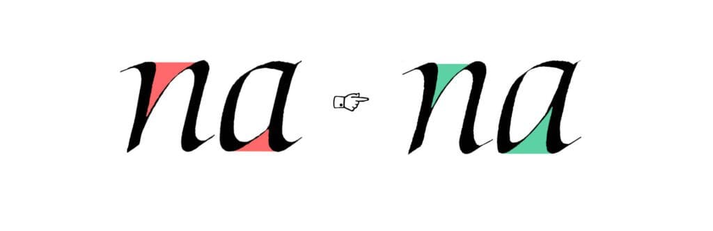
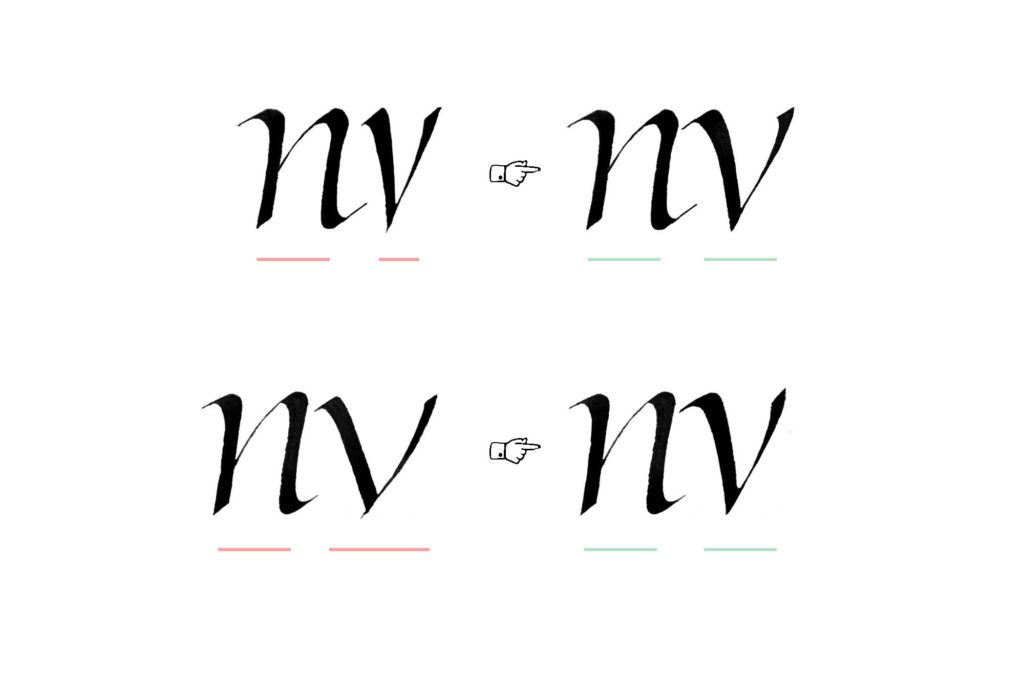
Case 2 – branching consistency
Many Italic letters include branching strokes, like the exit stroke on n. One of the most common problems here is inconsistency. Varying shapes or angles break the rhythm and disrupt the script’s internal logic.
Subtle variation can add liveliness, but the branches still need to feel like part of the same system. Look closely at the negative spaces they create, and aim for consistency in both shape and size to maintain an even visual rhythm.
Case 3 – The tittle
The tittle, which is a fancy typographic term for the dot above letters like i and j, should complement the letter, not overpower it. At the same time, it needs to be visible, so it shouldn’t be too light or faint either.

The same principle applies to accents and other diacritical marks: they shouldn’t feel like separate additions. It’s not just about matching weight, they should be made of the same visual components as the letters themselves. Shapes, line quality, contrast, and weight all matter.

Case 4 – clumsy swashes
When writing Italic with a 45-degree pen angle (a common recommendation), the top swashes can easily become too heavy. Watch their visual weight, and consider lightening them to keep the overall form balanced and refined. A lighter touch or a slight adjustment to the pen angle can help you soften the stroke without losing character.

Case 5 – Inconsistent turning points
The transition from a hairline into a vertical stem, or from the stem into a hairline, can vary in both shape and weight. It can be gradual, angular, pronounced, or subdued. These turning points play a significant role in shaping the overall tone of a letter. You can observe them in entry strokes, exit strokes, and in the shoulders of the letters (like in the n-arch).

The potential mistake arises from not paying attention to these shapes, which can lead to weak forms or inconsistency. Think of it as the way the curve carries weight into or out of the letterform. Pay attention to how the stroke flows, how the weight shifts, and how the transition is shaped. You might want to emphasize these parts of the letter or keep them more subdued. Either way, the key is consistency.

Troubleshooting Italic – Part 2
In the previous post of the series – Troubleshooting Italic Part 1, we focused on structurally simple Italic letters like i, n, and u. By taking a look at the most common problems, we laid the groundwork for understanding the most important visual ideas of this style.
In this post, we’ll turn our attention to a different group – letters with bowls and enclosed counters: a, d, g, q, b, and p. Some of the problems from the previous post will be back, and some will be specific to this set of letters.
Before we jump in, a quick aside: the problems I discuss are just that – problems, not laws. There are no rules you need to follow if you don’t want to. There’s no calligraphic police that will come for you if you generously space Gothic (please, don’t do this). That said, every design decision has consequences, and being aware of them is just as important as technical skill. Just because crossing two thick strokes adds weight and disrupts the flow doesn’t mean you can never do it. It just means you need to be especially careful when making that kind of decision, because it will lead to a specific outcome.
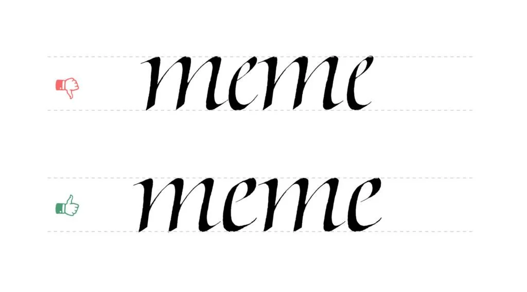
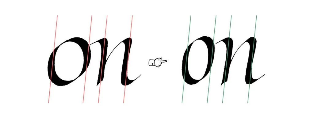
Case 1 – spacing (again)
We kicked off the previous post with the problem of spacing, and I stressed its importance. I’d even go as far as to say that if you’re able to evenly space your letters, you’re already ahead of most calligraphers.
In principle, it’s simple: it’s all about creating an even distribution of negative space—the space between and around the strokes. This requires a balance between the counters within the letters and the spaces between them. In practice, it’s one of the most difficult aspects of calligraphy.
Today, we’ll look at a more nuanced example than in Part 1. This time, we’re working with a word that includes the new letterforms with bowls and enclosed counters.
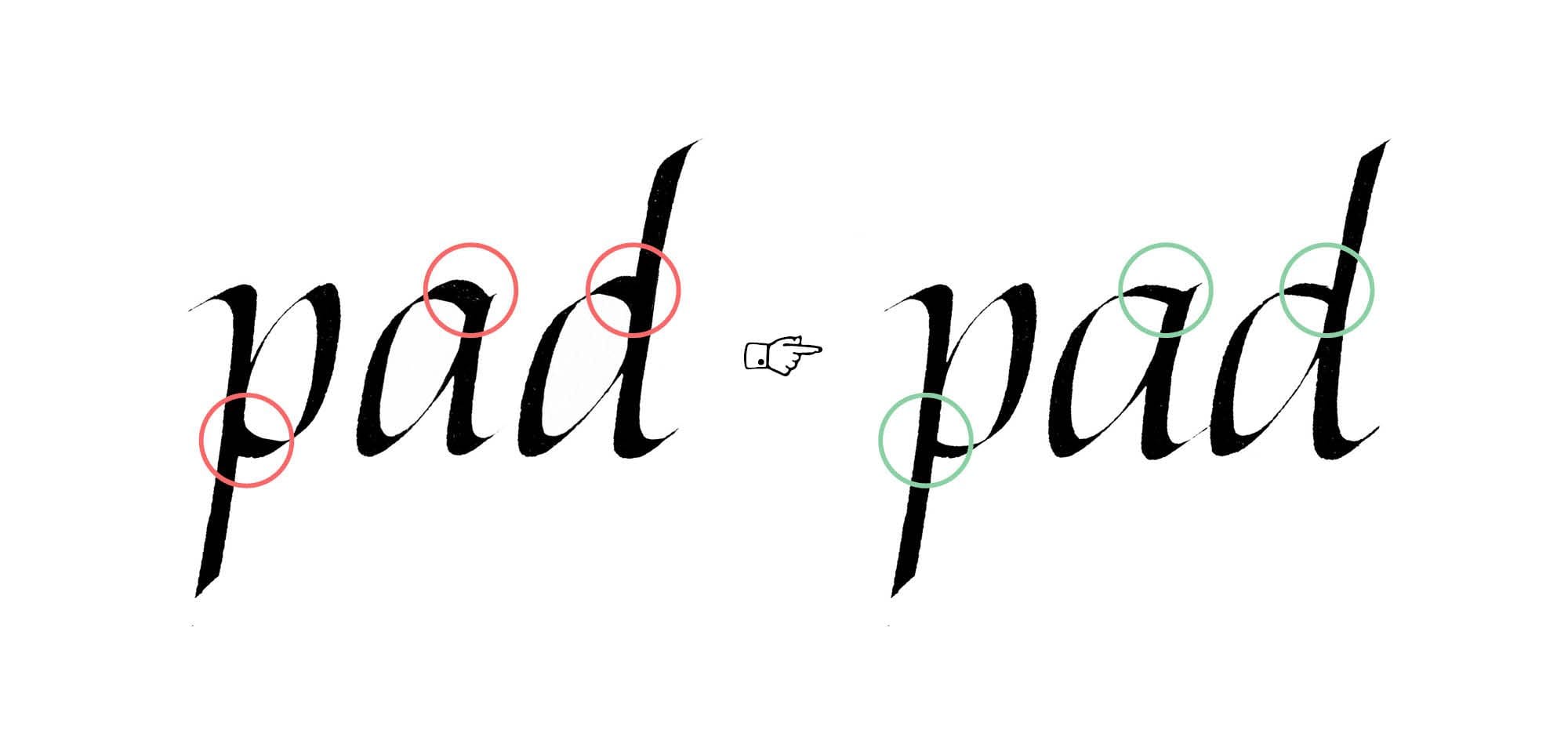
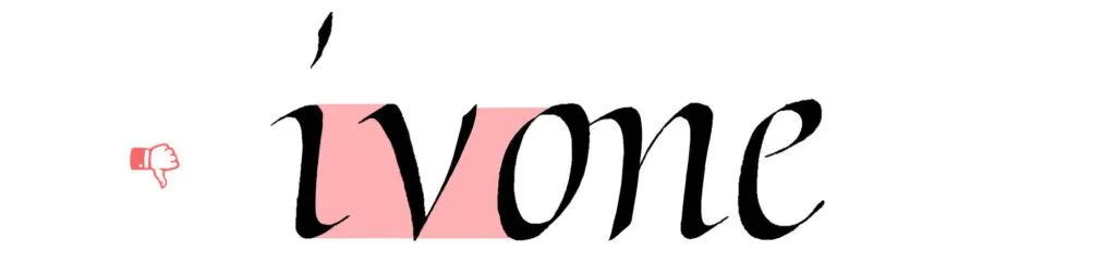
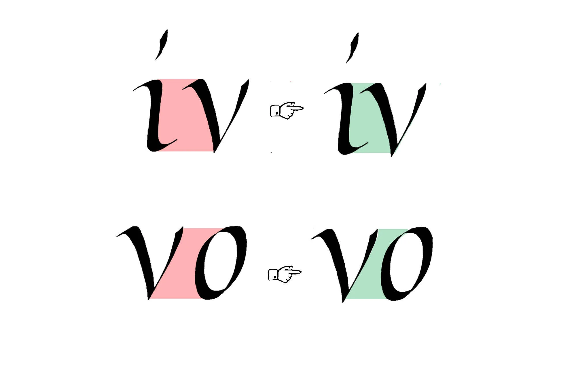
Case 2 – heavyweight intersections
The fix for this one can be tricky. It requires a lot of control: pen angle, pressure, and sometimes even a bit of subtle rotation mid-stroke. So what exactly is the issue, and why does it matter?
The short version: two thick strokes shouldn’t cross. When they do, they create a heavy, dark spot that pulls the eye and breaks the rhythm of the letter. You should be just as careful when the strokes only meet, like at the top of the a in the example.
This isn’t just a technical problem – it’s a visual one. Calligraphy, especially italic, depends on flow and contrast. Those dark spots throw things off. They make the letter feel clunky, even if everything else is working.
The fix? Pay close attention to how your strokes interact. A small change in angle or pressure can make all the difference.
Case 3 – The tail
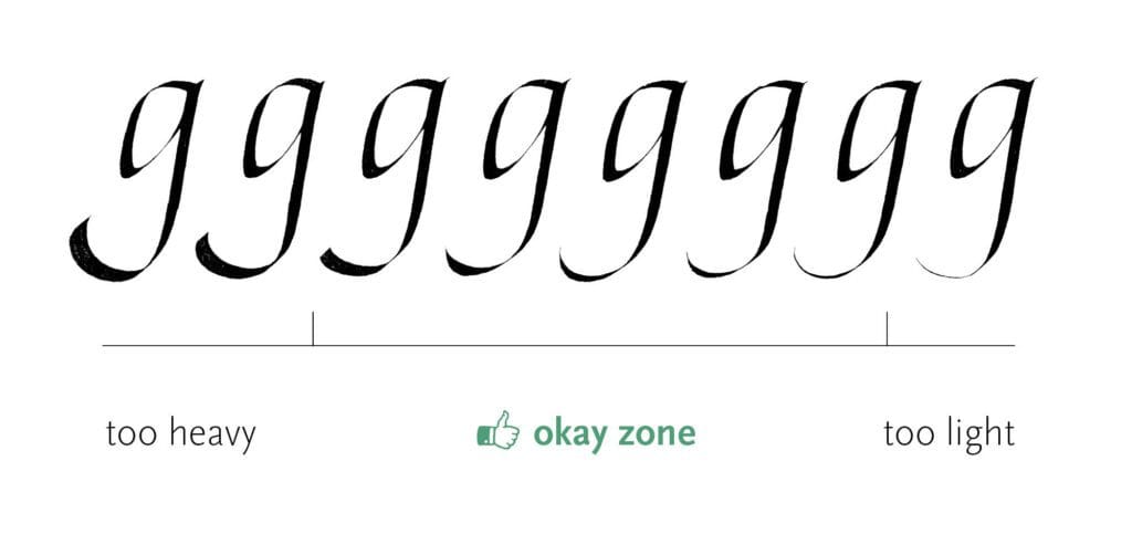
Remember when we discussed the weight of swashes in Part 1? Here, I want to take a closer look at one of them: the tail of the g. Its weight should match the rest of the letter, not overpower it, and not appear too fragile. The latter usually happens when the stroke gets extremely thin, but in practice, it’s much easier to go too heavy than too light.
That doesn’t mean it’s binary. There’s a whole scale of subtle variations that can work. A good rule of thumb for most letters? Avoid the extremes, unless the composition calls for it.
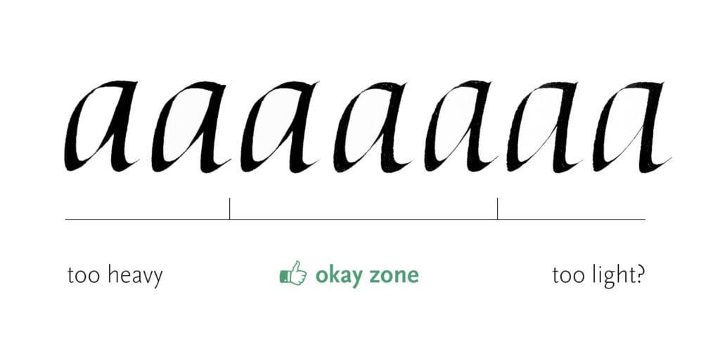
Case 4 – branching weight
This one applies to all letters with branching strokes, including some we covered in the previous post. If you want your letters to feel elegant, avoid adding too much weight to the branching stroke, especially where it meets the main stroke. It’s a similar issue to the one we saw with heavy intersections. You want to steer clear of that dense blob that disrupts the flow.
At the same time, the branching stroke needs some solidity and definition, so I try to avoid the other extreme as well. That said, a light branching stroke usually does less damage than a heavy one. (That’s why I added a question mark to the illustration.)
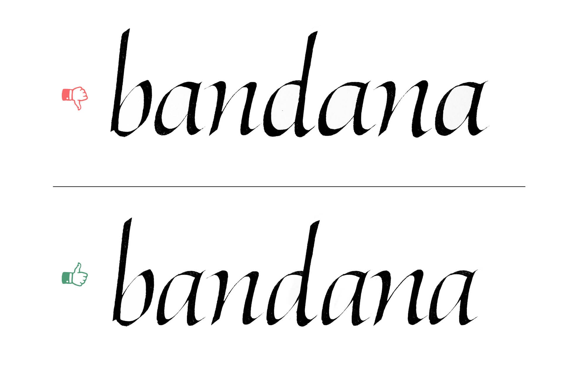
Case 5 – heavyset bowls
This mistake often comes from a misunderstanding of the bowl shapes in letters like a, d, b, and q.
If we’re aiming for the slender, elegant feel of formal italic, every part of the letter needs to support that idea, including the bowls. Beginners often make them too round, which gives the letters a heavier, more plump appearance.
Case 6 – branching strokes
The branching strokes issue from the previous post also apply to the letters with bowls. After all, these strokes appear in most of the letters in our new group. Remember, we’re aiming for consistency of forms – or at least controlled inconsistency (but that’s a topic for another time).
Troubleshooting Italic – Part 3
This post is part of the ongoing series about fixing common and uncommon problems with Italic minuscules. So, before moving on, make sure you’ve seen the other parts. In Part 1, we established the structural foundation by examining the simplest letters. Part 2 was all about the letters with bowls, such as a, b, or p. Now, it’s time to turn our attention to the round letters – o, c, and e.
You might wonder – What? Only three letters in this group? Don’t be tricked by their apparent simplicity – these letters are full of subtle challenges that you need to worry about.
Spacing
As always, I’ll start with the spacing, so here we are for the third time. The letters from this group bring even more complexity to the problem.
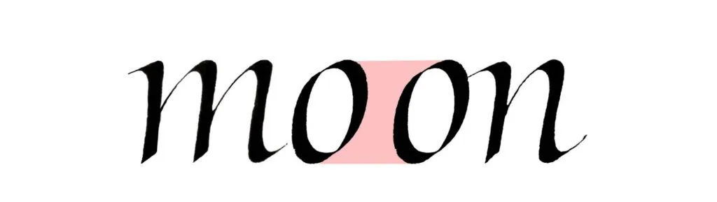
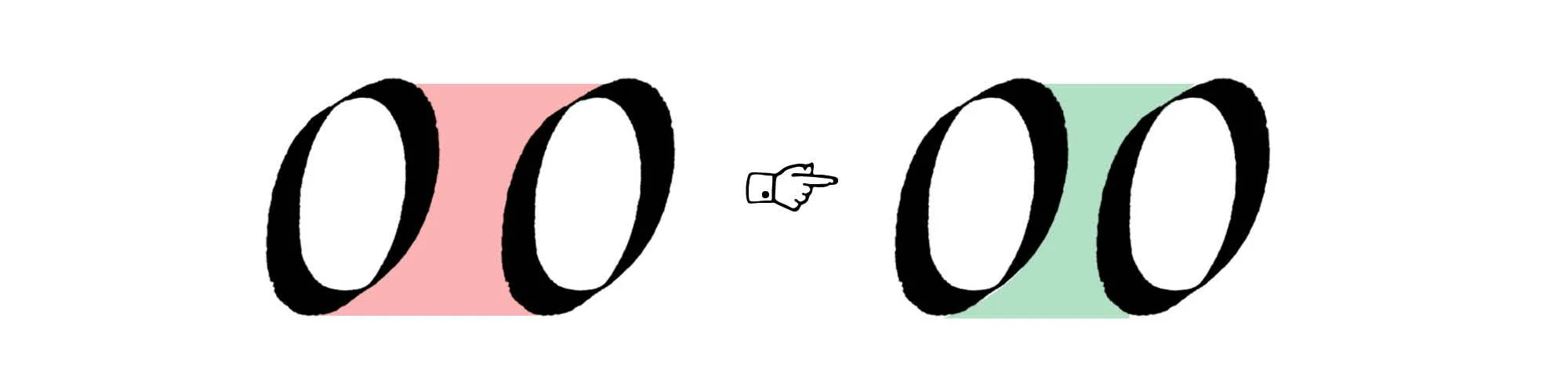
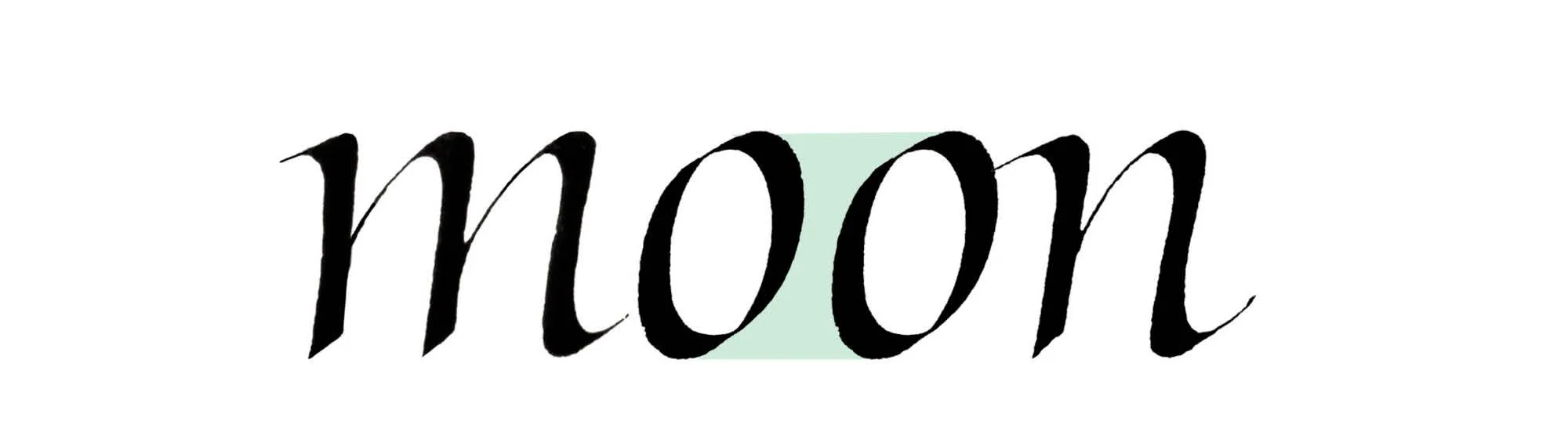
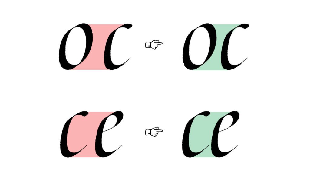
Let’s start with the simpler aspect. The spacing between two rounded letters needs to be closer, because of those additional areas above and below the curved parts. Think of the pairs like oo, oc, or oe. It’s the same problem and solution that we encountered in the previous parts when looking at the facing bowls.
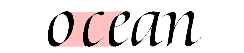
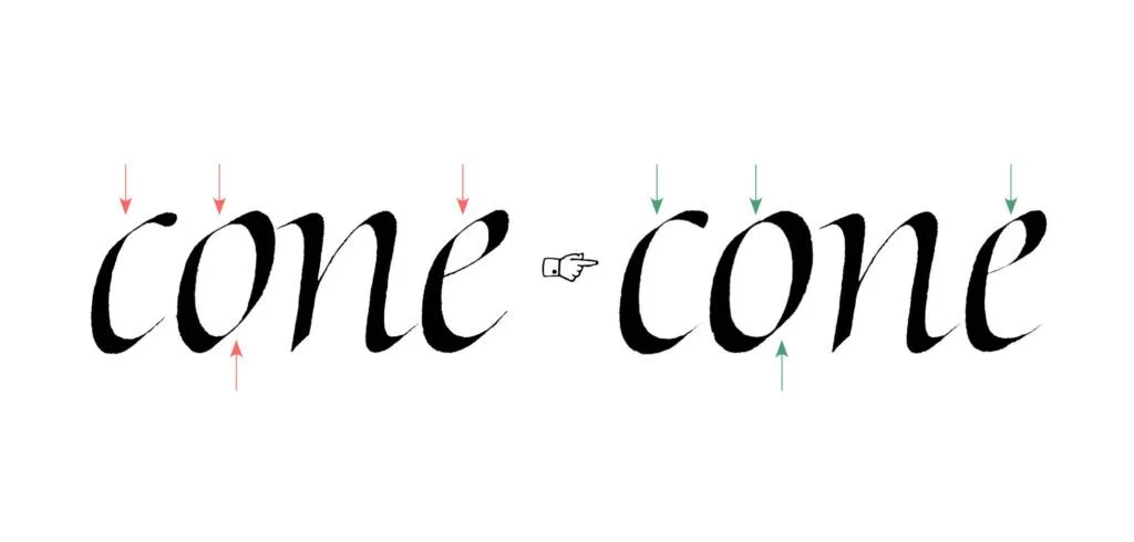
The real troublemakers are the letters with open counters – like c and e. There’s no clear division between the counter of the letter and the space between letters. Comparing the overall areas between letters is useful in most cases, but how do you do this where there is no clear boundary between the inner and outer space? Ultimately, you need to trust your optical judgment, and the only way to refine it is to practice self-criticism of your work.
Weak connections
The quality of connections between strokes significantly impacts how strong and fluid a letterform feels. Overly extended, thin hairlines between the strokes are usually trouble. They disrupt the visual flow and create a sense of fragility in the letter.
Instead, aim for connections where strokes appear to flow seamlessly into one another, maintaining consistent weight and harmony. Think of italic letters as delicate but solid constructions rather than a few strokes being stitched together with strings.
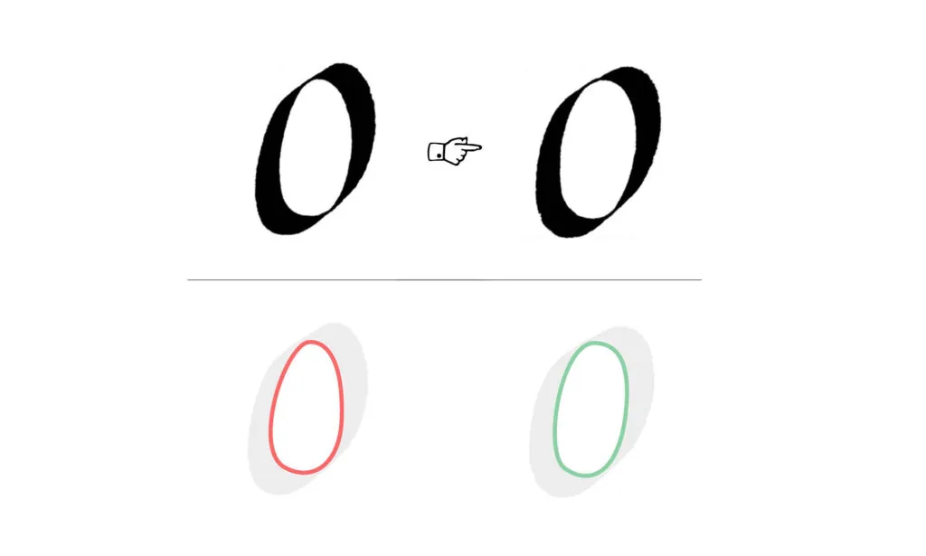
Asymmetrical o
Both strokes of the o should be more or less similar. Here’s a simple test: if you rotate the letter 180 degrees, you should end up with a similar shape. The strokes don’t have to perfectly mirror each other (mine never do!), but avoid big differences.
You can simply look at the counter of the letter instead of the strokes and decide whether it’s symmetrical. Avoid the egg-shaped counter of the o! It always feels heavyweight and awkward.
Bulky top stroke
The upper stroke of the c and e can’t overweight the entire letter. If it’s too heavy, it causes the letter to optically “roll” to the right side. On the other hand, you shouldn’t make it too light either, because then the letter feels incomplete.
It’s a balancing act, and the best solution usually lies somewhere in the middle ground between extremes.
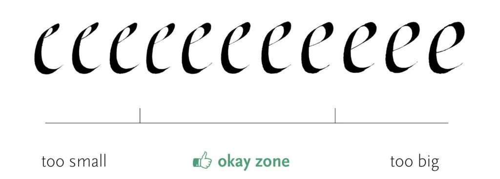
Letter too small or too big
With rounded letters, it’s very easy to lose your sense of proper scale. You can’t simply follow the guidelines blindly. The perceived size of letters isn’t just about height and width – it’s also about shape, weight distribution, and counter sizes.
Sometimes you have to slightly overshoot or undershoot the guidelines to make an optical correction. Remember – your eyes should always be the final judge. Grids and lines that you draw are there to help you, not to dictate everything that you do.
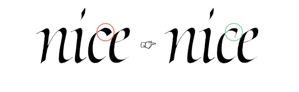
The eye
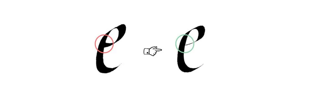
We already talked about the bulky top of the c and e, but it’s not only about stroke weight. The eye of the e – that’s what we call the e’s counter – should be properly balanced.
What does this mean? It shouldn’t catch too much attention by enclosing a very tiny space, but it also shouldn’t overwhelm the letter by being more spacious than the lower open counter. The eye should feel like an integral part of the letter.
Heavy horizontal stroke in e
Avoid making the crossbar (or lower part of the bowl) of the e too heavy. Remember what we discussed in previous posts about thick intersections? This tends to create a heavy, dark spot where the strokes connect, making the letter feel a bit too heavyset.
Keep that part in check, and the whole letter will feel more balanced.
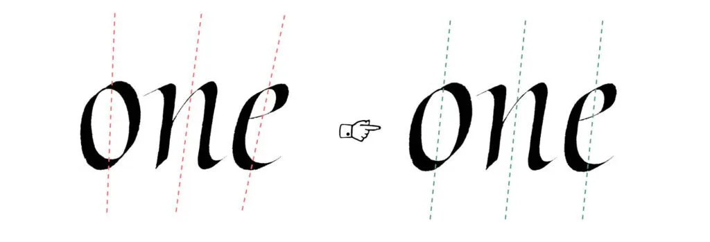
Letter missing the slant
It’s easy to judge the slant of letters with straight strokes. But it’s much trickier with diagonal and rounded strokes. You need to visualize the axis of the letter, which results from the balance of all the strokes working together.
It’s similar to forces in physics balancing each other – there’s an invisible line (the axis) running through each letter. When that gets thrown off, the whole thing becomes wobbly and unstable.
Roundness of the letters
Italic is known for slender, rather narrow letterforms. It’s easy to grasp the proportions of letters like n, m, or u, but beginners tend to make rounded letters a bit too wide. Unless you’re intentionally going for a variable rhythm (and you really need to know what you’re doing to make that work), you should aim for a consistent pace of strokes and spaces in your writing.
The easiest letter from our set is the o, so let’s focus on that. Here’s a trick I use: compare the letter o with another simple, basic form – the letter n. Put them side by side and you’ll see that a properly constructed o has a similar amount of white space in its counter. Not exactly the same, but they should feel like they come from the same family.
Troubleshooting Italic – Part 4
Spacing
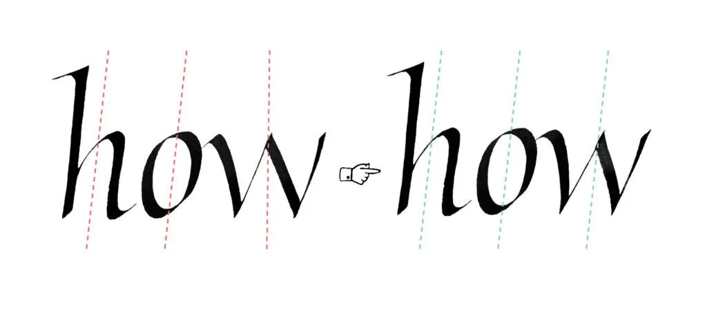
We’ll start with spacing again, and believe me, these letters are among the most challenging when it comes to establishing a clean visual rhythm. Similar to the round letters from Part 3, the triangular letters have a considerable amount of white space around them. Their triangular shape leaves more space near the baseline, with wider counters at the top. The right-side stroke is usually lighter than the left, which also affects the spacing.
Because your right-side stroke can have a different weight than mine, you may want to make extra adjustments. Depending on how light or heavy you write it, the following letter should be placed closer or further away.
Stroke Thickness
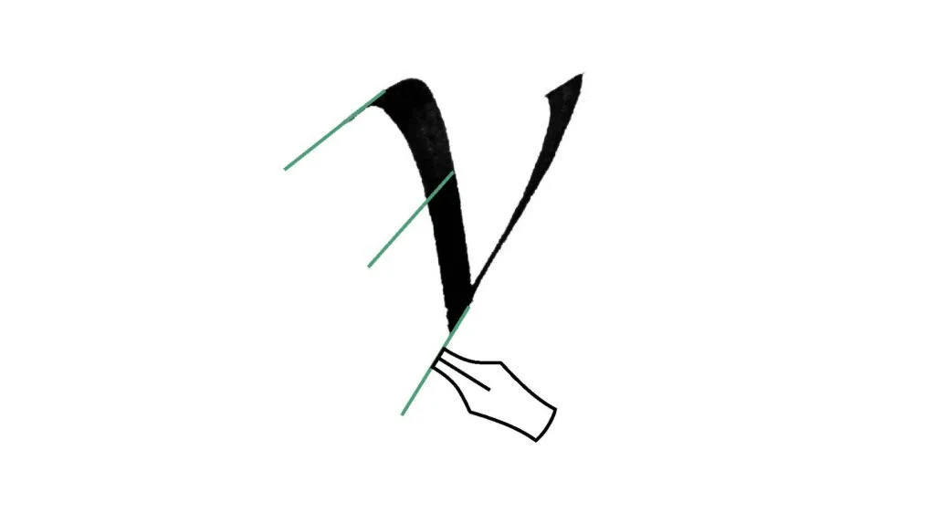
Another challenge lies in the weight of the diagonal strokes. If you stick to the same pen angle as for the vertical strokes, you might end up with a stroke that feels bulky – and we don’t want that. The solution to this problem is often to adjust the pen angle to a steeper value. A more effective approach is to use pen rotation. This means changing the angle as you write the stroke by shifting the pen in your hand. It’s pretty tricky to use, but it’s an essential technique if you want to elevate your calligraphy.
Note that I don’t provide the exact pen angles here. They’re dependent on the slant of your Italic, which may be different than my example. It’s better to think in terms of steeper/shallower angles and thicker/thinner strokes than to focus on mathematical values.
The right-side stroke is trickier: it should be lighter than the left, but not so light that it looks fragile compared to its neighbours. If it’s too heavy, it dominates the letter, and if it’s too light, it gets lost and breaks the rhythm. Judge it in context and aim for a v that still feels like it belongs to the same family.
Width
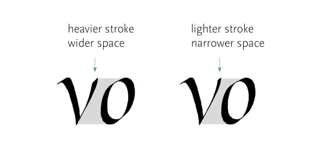
In letters with parallel strokes (like n), it’s easy to sense the proper width of the letter. The v, w, and y pose more problems. Look at the balance between the counter and the outside space. It should create a similar visual rhythm to what you find in other letters.
Slant
Another big problem is aligning the letter to the proper slant. You can easily see the slant in letters like n, but it’s trickier with our triangular group. Think of the slant as the resultant force created by your diagonal strokes. In the letter w, the slant of the inner triangle is most important and determines whether the letter follows the axis of the script.
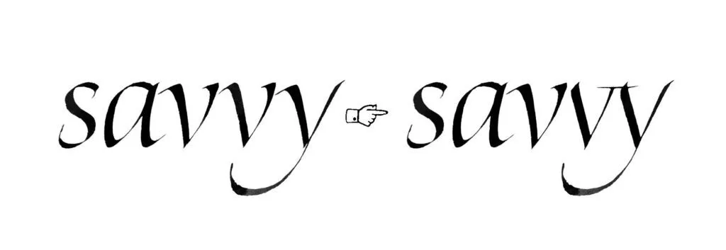
Ligatures and Modifications
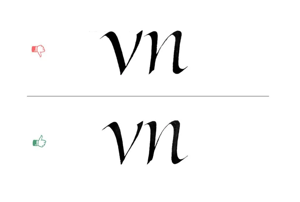
We already discussed spacing, but some cases are difficult to resolve simply by adjusting the distance between the letters. In pairs like rv or vv, it becomes increasingly difficult, and you might need to resort to ligatures to make it work.
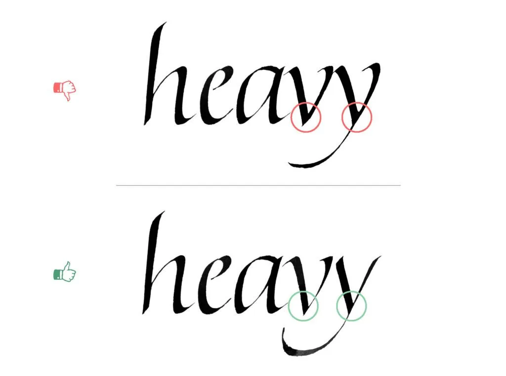
Joins
In Part 2, we already discussed the need to avoid heavy joins. Similarly, the connection in the lower part of the triangular letters should be fairly light, so it doesn’t add too much bulkiness. The right-side stroke doesn’t need to be a hairline, but avoid letting two heavy strokes overlap. To fix this common problem, keep the connection light enough that the letters don’t become bulky, while remaining solid.
Overshoot
Triangular letters behave differently on the baseline. Because their apex sits at a single point, v and w can appear to be too high if you place them directly on the baseline. Lowering them slightly corrects this illusion. With y, the tail balances the shape, so you don’t need to make the same adjustment. The effect is amplified in heavier variations of Italic.
The key point: be extra careful not to place triangular letters too high, because the effect will be exaggerated compared to other letters. It’s better to let them sit a touch lower than to risk them floating above the baseline.
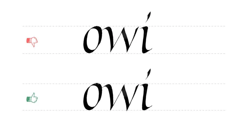
In type design, this correction is called the overshoot, and means an adjustment of the placement of your letter on the baseline. Tobias Frere-Jones explains this in depth in his article, The Optical Illusion That Tricks Our Brains Into Perceiving Typeface Letters Are of Equal Height.
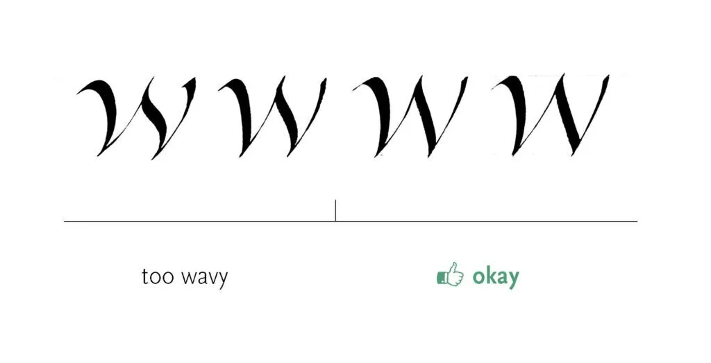
Wavy strokes
The third stroke of the w can be given a gentle wave, but beginners often overdo this, which results in a wobbly, uneven form. If your Italic isn’t meant to look playful (which can be valid in some contexts) and you want an elegant, consistent feel, the strokes should resolve in a smooth, gradual manner. Few things disrupt rhythm more than a sudden wobble. This principle extends beyond w: a touch of waviness in swashes can be expressive, but if exaggerated, it creates the same problems of imbalance and broken flow.