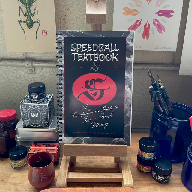
To put it simply, calligraphy is the art of writing letters, while hand-lettering is the art of drawing them. Calligraphy relies on single, fluid strokes created with specialized tools like nibs to achieve "thicks and thins" through pressure, whereas hand-lettering involves building, sketching, and illustrating letterforms using markers or pens. One is a rhythmic dance of muscle memory, while the other is a creative construction of shapes.
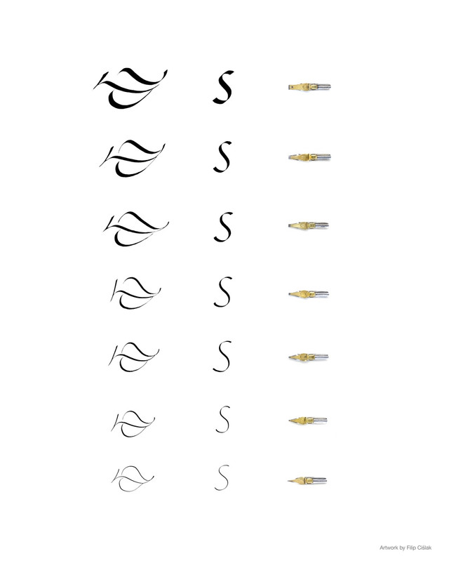
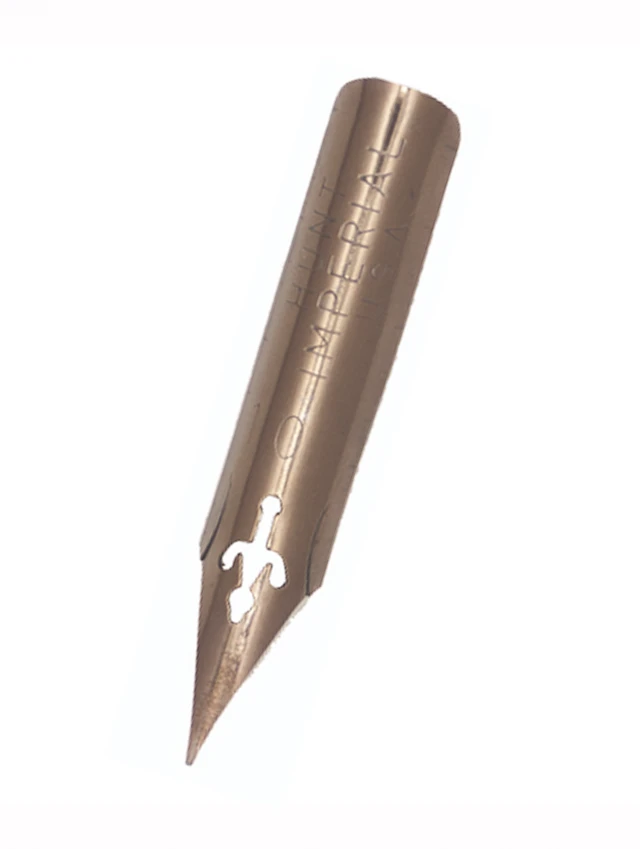
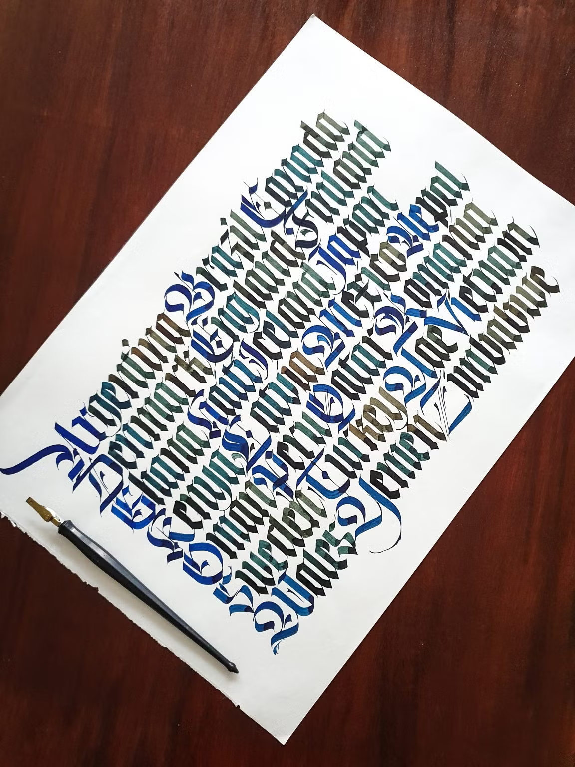
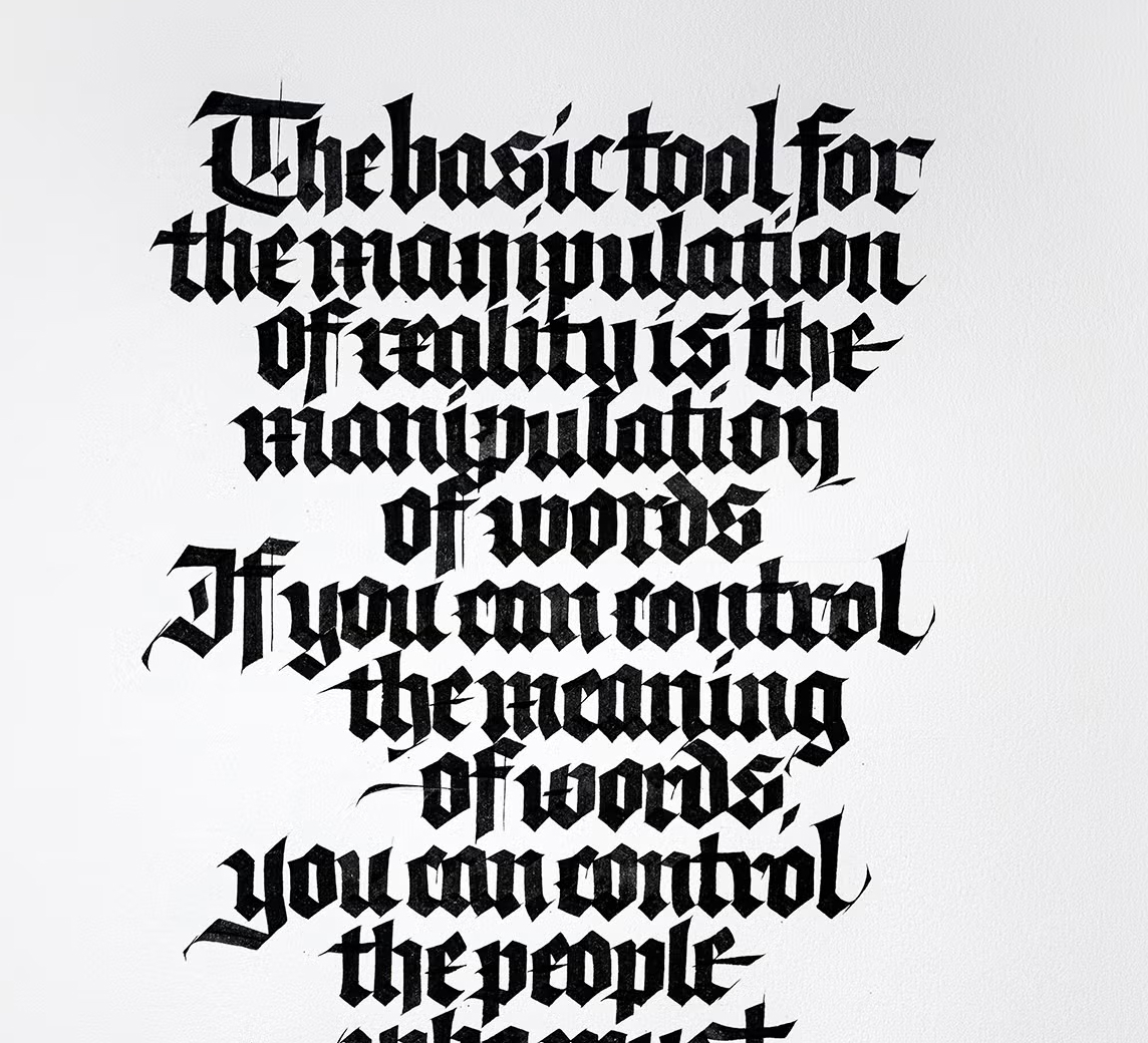
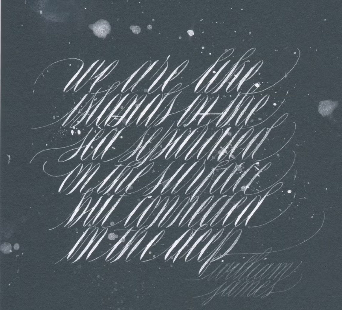
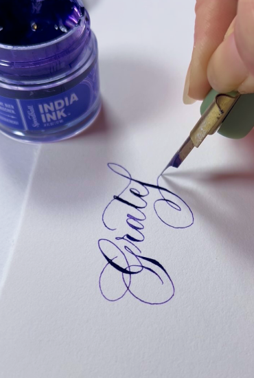
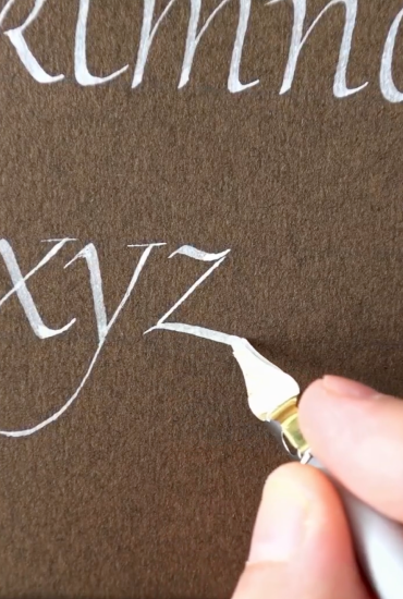
While the worlds of calligraphy and hand-lettering often overlap in the beautiful pursuit of stylized alphabets, understanding the technical distinction between the two is the first step in mastering either craft. When you engage in calligraphy, you are focused on the "stroke." It is a rhythmic, disciplined practice where the beauty of the letterform is created in a single, fluid motion. Calligraphy relies heavily on the physicality of the tool, specifically the precision-engineered steel nib. By varying the pressure applied to a flexible dip pen nib, the artist causes the tines to spread, allowing a controlled flow of ink to create the characteristic "thicks and thins" of traditional scripts like Copperplate or Spencerian. This process requires significant muscle memory and an understanding of the "angle of the dangle"—the specific degree at which the pen meets the paper—to ensure the ink flows consistently without snagging the fibers. It’s a meditative process that rewards patience and precise hand control.
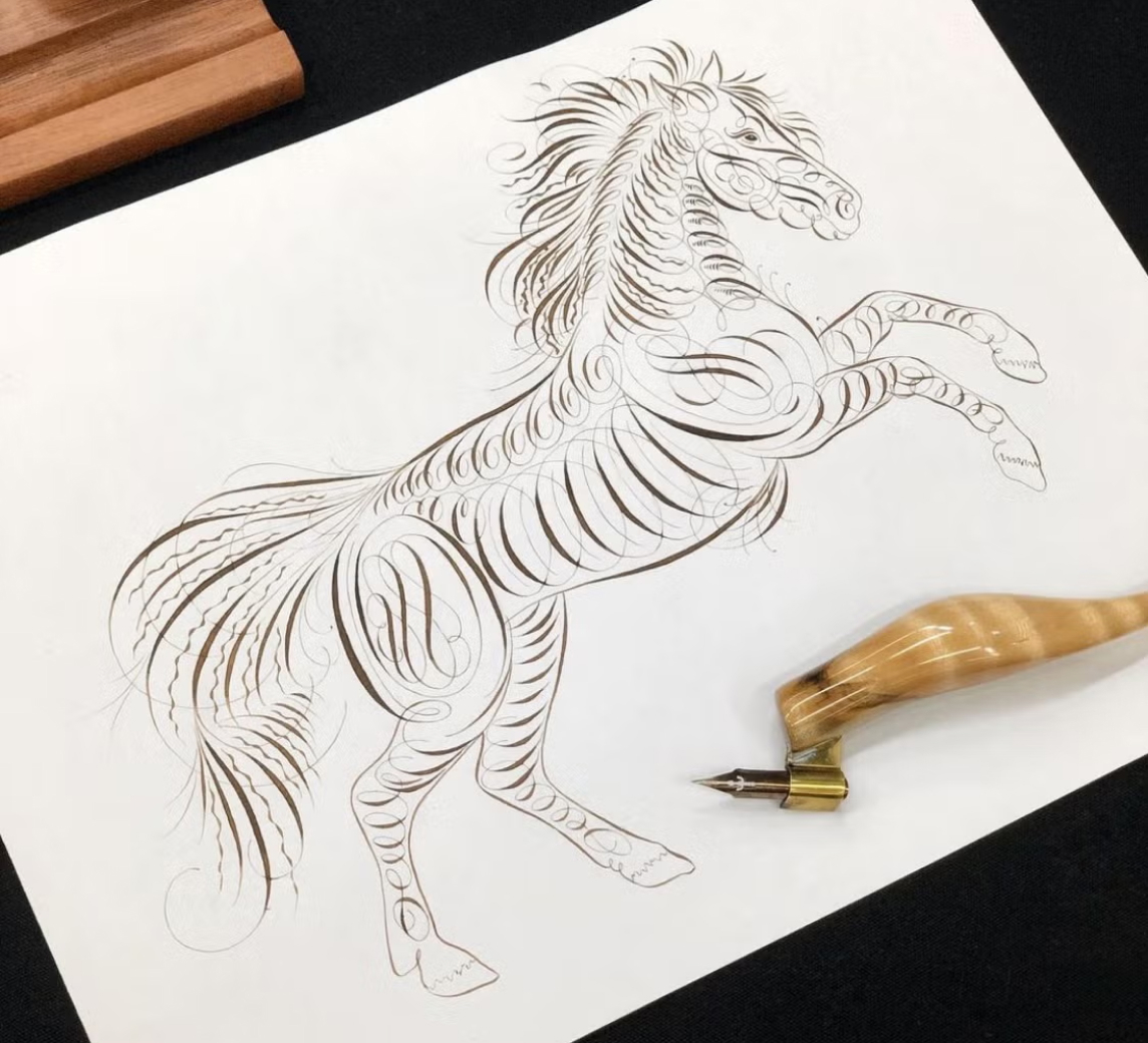
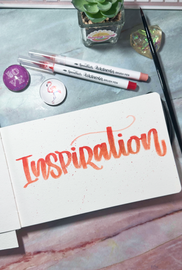
Hand-lettering, by contrast, is much more akin to illustration. Instead of executing a letter in one fluid pass, a letterer is "building" a character through multiple strokes, sketches, and refinements. While a calligrapher’s line is often final the moment it hits the page, a hand-letterer might use markers or fine-liners to outline a letter, adjust its weight, and then go back to fill in the color or add decorative flourishes. This makes hand-lettering incredibly approachable for beginners because it allows for "fixing" mistakes. If a curve isn't quite right, you simply draw over it or refine the shape. It is a highly versatile medium where you can experiment with shadows, 3D effects, and intricate patterns inside the letters themselves—things that are nearly impossible to achieve with a traditional dip pen. This is where high-quality hand-lettering markers shine, offering the flexibility to create "faux calligraphy" by manually drawing in the thick downstrokes that a nib would create naturally.
Choosing between the two often depends on the desired outcome and the artist's personal pace. Calligraphy is often sought after for its elegance, ceremony, and the meditative quality of the "ink and nib" experience. It remains the gold standard for wedding invitations, formal certificates, and historical manuscripts where the authenticity of the pen stroke is paramount. On the other hand, hand-lettering is the darling of modern graphic design, chalkboard art, and punchy social media quotes. It offers a playful, graphic freedom that isn't bound by the strict rules of traditional scripts. Whether you are looking for the graceful, rhythmic flow of a professional nib or the vibrant, illustrative control of a brush marker, knowing the difference allows you to select the right tool for your specific creative vision. Ultimately, calligraphy teaches you the DNA of the letters, while hand-lettering gives you the freedom to dress them up in any style imaginable.